

Brand colors influence how customers perceive a business before they read a headline, visit a website, or interact with a product. Color theory for branding is the process of selecting and combining colors to communicate a specific brand personality, improve recognition, and create consistent customer experiences across every touchpoint.
Businesses use color theory to shape perception, strengthen visual identity, and support marketing objectives. A carefully planned color palette can help a company appear trustworthy, premium, energetic, creative, or approachable, depending on its goals and audience. Strong color decisions improve recognition, while poor color decisions often create confusion and weaken consistency.
Effective branding goes beyond choosing colors that look attractive together. Businesses need to understand color psychology, color harmony, accessibility, competitive positioning, and practical implementation across websites, social media, packaging, advertising, and print materials.
This guide explains how color theory works in branding, how different colors influence perception, how to choose a brand color palette, common mistakes to avoid, and how businesses can create color systems that remain effective as they grow.
Why Brand Colors Matter More Than Most Businesses Realize
Brand colors influence recognition, perception, and trust. While logos, typography, and messaging all contribute to brand identity, color is often the first element customers notice.
Research from branding and marketing studies consistently shows that visual impressions form quickly. Customers often develop an initial perception of a business before evaluating products, services, or pricing. Color plays a significant role in that process.
Businesses that treat color as a strategic asset often create stronger visual identities than businesses that choose colors based on personal preference.
Color Influences First Impressions
Color communicates information immediately.
Before a customer reads a headline or evaluates a product, color creates expectations about the business. A luxury brand using black and gold communicates something different from a wellness brand using green and white. A technology company using blue creates a different impression than an entertainment brand using red.
These perceptions are not universal rules, but they influence how customers interpret visual communication.
Several factors shape first impressions:
- Color selection
- Color contrast
- Visual hierarchy
- Industry expectations
- Cultural associations
The combination of these factors influences whether a brand appears professional, trustworthy, modern, premium, playful, or innovative.
Color Improves Brand Recognition
Recognition depends on repetition.
When businesses consistently use the same colors across websites, advertisements, social media graphics, packaging, presentations, and marketing materials, customers begin associating those colors with the brand.
Many globally recognized companies have built strong associations with specific colors:
- Coca-Cola is strongly associated with red
- Starbucks is strongly associated with green
- Netflix is strongly associated with red and black
- Tiffany & Co. is strongly associated with Tiffany Blue
- Spotify is strongly associated with green
Customers often recognize these brands even when logos are absent because color has become part of their visual identity.
Consistency Builds Trust
Trust develops through familiarity.
Customers feel more confident when visual experiences remain consistent across different channels. A website should feel connected to social media content. Packaging should feel connected to advertising. Marketing materials should reinforce the same visual identity.
Consistent color usage helps create that connection.
Brand color guidelines define how colors should appear across digital and print applications. These guidelines often include:
- Primary colors
- Secondary colors
- Accent colors
- RGB color model values
- CMYK color model values
- Accessibility requirements
- Usage recommendations
Businesses with clear color systems create more cohesive experiences and stronger long-term recognition.
Understanding Color Theory Without Design Jargon
Many business owners hear the term “color theory” and assume it belongs exclusively to designers. In reality, color theory for branding is simply a framework for choosing colors that work together and communicate the right message.
The goal is not to memorize every part of the color wheel. The goal is to understand how color influences perception and how different combinations affect customer reactions.
When applied correctly, color theory helps businesses:
- Improve brand recognition
- Create visual consistency
- Strengthen customer trust
- Support marketing campaigns
- Differentiate from competitors
A successful brand color palette balances psychology, strategy, usability, and consistency rather than focusing only on aesthetics.
What Color Theory Actually Means for Branding
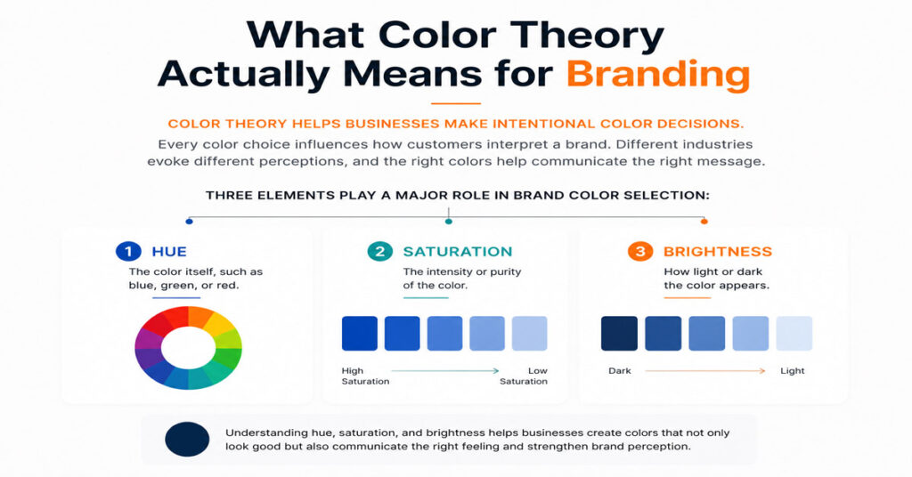
Color theory helps businesses make intentional color decisions.
Every color choice influences how customers interpret a brand. A financial institution often uses different colors than a children’s toy company because the desired perception is different. The same principle applies to luxury brands, healthcare providers, technology companies, restaurants, and e-commerce businesses.
Three elements play a major role in brand color selection:
- Hue: The color itself, such as blue, green, or red.
- Saturation: The intensity of the color.
- Brightness: How light or dark the color appears.
These elements influence whether a brand feels energetic, professional, premium, modern, approachable, or innovative.
Color theory also includes color harmony. Color harmony refers to combinations that work together visually without creating conflict.
Common color harmony systems include:
- Complementary colors
- Analogous colors
- Triadic colors
- Monochromatic palettes
Design tools such as Adobe Color and Coolors help businesses experiment with these combinations while maintaining balance.
How Customers Emotionally Respond to Color
Customers rarely make decisions based on color alone, but color influences emotional perception.
Certain color associations appear consistently across industries:
- Blue often communicates trust and reliability.
- Green often communicates growth and wellness.
- Red often communicates energy and urgency.
- Black often communicates luxury and authority.
- Yellow often communicates optimism and visibility.
These associations influence expectations before customers engage with products or services.
The key point is that color psychology supports branding rather than controlling it. A poorly designed brand using the “right” color still performs poorly. Strong branding combines color, typography, messaging, imagery, and customer experience.
Why Context Matters More Than Color Meanings
Many articles present color psychology as a set of universal rules.
Reality is more nuanced.
A color does not carry the same meaning in every industry, culture, or situation. Blue may communicate trust in banking, but innovation in technology. Black may communicate luxury for a fashion brand and sophistication for a premium automotive company.
Context influences interpretation through:
- Industry standards
- Target audience expectations
- Cultural associations
- Competitive landscape
- Product category
Businesses should treat color psychology as guidance rather than a strict formula.
The strongest color decisions come from understanding customers, market position, and brand personality rather than relying on generic color charts.
How Different Colors Influence Brand Perception
Different colors influence perception in different ways. While color alone cannot define a brand, color choices contribute significantly to how customers interpret visual identity.
The following examples represent common branding applications rather than fixed rules.
Blue: Trust, Stability, and Professionalism
Blue remains one of the most widely used colors in branding.
Many financial institutions, software companies, healthcare providers, and professional service firms rely on blue because it communicates reliability and confidence.
Blue often works well for businesses that want to emphasize:
- Trustworthiness
- Security
- Professional expertise
- Stability
- Dependability
This explains why blue appears frequently in banking, insurance, technology, and consulting industries.
The challenge with blue is differentiation. Many competitors already use it, making brand identity systems and typography even more important.
Red: Energy, Urgency, and Confidence
Red attracts attention quickly.
Brands use red to create urgency, excitement, passion, or confidence. Retail promotions, entertainment brands, sports organizations, and food companies frequently incorporate red into their visual identities.
Red is commonly associated with:
- Energy
- Action
- Excitement
- Confidence
- Attention
Companies such as Coca-Cola and Netflix have built strong recognition through consistent use of red.
Red works particularly well when visibility and impact are priorities.
Green: Growth, Wellness, and Sustainability
Green is strongly connected to nature, health, growth, and sustainability.
Businesses in wellness, environmental services, organic products, and financial sectors often use green to reinforce these associations.
Green commonly communicates:
- Growth
- Health
- Sustainability
- Balance
- Renewal
Starbucks demonstrates how a consistent green identity can become a powerful recognition asset.
Green performs well when businesses want to emphasize responsibility, well-being, or long-term value.
Yellow: Optimism and Attention
Yellow attracts attention while creating a sense of positivity.
Brands often use yellow as a supporting color because it remains highly visible across digital and physical environments.
Yellow is frequently associated with:
- Optimism
- Positivity
- Energy
- Warmth
- Visibility
Fast-food brands, retail businesses, and consumer products often use yellow to increase visibility and reinforce approachable personalities.
The challenge with yellow is readability. Certain shades create contrast issues when paired incorrectly.
Orange: Creativity and Approachability
Orange combines the energy of red with the friendliness of yellow.
Many creative businesses, startups, educational platforms, and modern service brands use orange to appear innovative without becoming overly aggressive.
Orange often communicates:
- Creativity
- Enthusiasm
- Friendliness
- Confidence
- Innovation
This balance makes orange particularly effective for brands seeking a modern and approachable identity.
Black: Luxury, Authority, and Sophistication
Black remains one of the strongest colors for premium positioning.
Luxury brands often rely on black because it creates a sense of exclusivity, elegance, and authority.
Black commonly supports perceptions of:
- Sophistication
- Luxury
- Confidence
- Authority
- Timelessness
Many premium fashion, automotive, and lifestyle brands use black as a foundation color because it pairs effectively with both minimal and complex identity systems.
White: Simplicity and Clarity
White creates space.
While white is often overlooked in branding discussions, it plays an important role in modern design systems. White improves readability, strengthens hierarchy, and helps other colors stand out.
White often communicates:
- Simplicity
- Clarity
- Cleanliness
- Transparency
- Modernity
Brands that prioritize minimalism frequently use white to create visual balance and improve user experience.
How To Choose The Right Brand Colors For Your Business
Choosing brand colors should involve strategy rather than personal preference.
The strongest color palettes align with business goals, audience expectations, and market positioning.
Start With Your Brand Personality
Before selecting colors, define the personality you want customers to associate with the brand.
Questions worth answering include:
- Should the brand feel premium or accessible?
- Should the brand feel modern or traditional?
- Should the brand feel energetic or calm?
- Should the brand feel authoritative or friendly?
Color decisions become easier when personality is clearly defined.
Consider Your Target Audience
Different audiences respond to visual communication differently.
A luxury audience often expects different color palettes than a budget-conscious audience. A technology buyer often responds differently than a consumer shopping for lifestyle products.
Audience expectations should influence color decisions more than personal preferences.
Study Your Competitors Without Copying Them
Competitor research helps identify opportunities.
Look for patterns within your industry and evaluate how competitors position themselves visually.
The goal is not imitation.
The goal is to understand where differentiation exists.
Businesses that copy competitor palettes often weaken their ability to stand out.
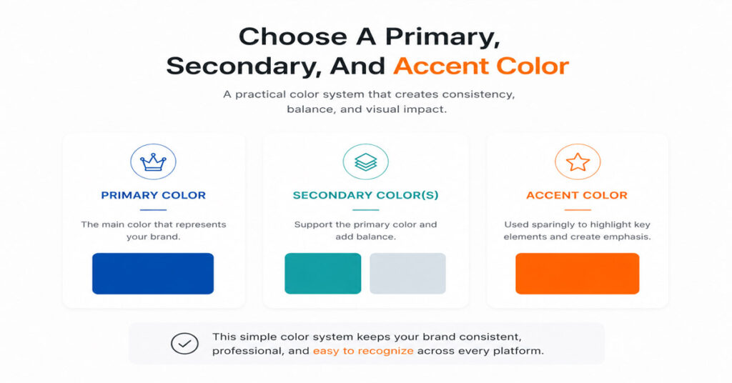
Choose A Primary, Secondary, And Accent Color
Most brands do not need ten colors.
A practical color system typically includes:
- One primary color
- One or two secondary colors
- One accent color
This structure simplifies implementation while maintaining flexibility across websites, social media, advertising, packaging, and print materials.
Common Brand Color Mistakes That Hurt Recognition
Many businesses invest in logo design, websites, and marketing campaigns without developing a clear color strategy. The result is often a visual identity that feels inconsistent or forgettable.
Strong branding depends on recognition. Recognition depends on consistency. Several common mistakes make that goal harder to achieve.
Choosing Colors Based on Personal Preference
Personal preference is one of the most common reasons businesses choose ineffective color palettes.
A founder may prefer purple. A marketing manager may prefer blue. A business owner may dislike yellow. None of these preferences should determine brand colors.
Color selection should be guided by:
- Brand personality
- Target audience expectations
- Industry positioning
- Competitive differentiation
- Marketing objectives
The question is not “What color do I like?”
The question is “What color best supports the perception I want customers to have?”
Using Too Many Colors
A complex color palette often creates inconsistency.
When businesses introduce too many primary colors, visual identity becomes difficult to manage across different platforms. Marketing materials begin to look disconnected, and recognition becomes weaker.
Common symptoms include:
- Social media graphics using different color combinations
- Advertising campaigns that feel unrelated to the website
- Packaging that looks disconnected from the brand
- Presentations that follow different visual styles
Most successful brands rely on a limited color system and use it consistently.
A smaller palette is often easier to recognize and easier to scale.
Following Trends Without Strategy
Color trends change regularly.
Every year, new palettes gain attention across design communities, social media platforms, and creative marketplaces. Trend reports from organizations such as the Pantone Color Institute often influence design decisions.
The problem occurs when businesses adopt trends without evaluating whether those colors fit their brand.
A color trend may generate attention today while weakening recognition tomorrow.
Businesses should prioritize:
- Brand consistency
- Audience expectations
- Long-term recognition
Trend adoption should support strategy rather than replace it.
Ignoring Accessibility and Readability
Accessibility directly affects usability.
A color palette that looks attractive but fails accessibility standards creates friction for users.
Businesses should test:
- Text contrast
- Background contrast
- Mobile readability
- Website accessibility
- Color blindness considerations
Web Content Accessibility Guidelines (WCAG) contrast ratios provide useful standards for evaluating readability.
Accessibility improvements benefit every user, not only users with visual impairments.
Creating A Brand Color Palette That Works Across Every Platform
A color palette should function consistently wherever customers encounter the brand.
Many businesses create palettes that look effective in one environment but fail in others. A color may look excellent on a website and perform poorly on packaging. Another color may work in print but lose impact on mobile devices.
Effective brand color systems consider every application before implementation.
Website and Digital Use
Digital platforms often create the first interaction between customers and brands.
Color systems should support:
- Readability
- Navigation
- User experience
- Visual hierarchy
- Conversion-focused design
Digital design commonly relies on RGB (Red, Green, Blue) color values because screens display color through light.
Businesses should establish standards for:
- Primary interface colors
- Button colors
- Background colors
- Text colors
- Accent colors
These standards create consistency across websites, landing pages, and digital products.
Social Media Consistency
Social media content often reaches customers more frequently than websites.
Consistent color usage helps audiences recognize a brand while scrolling quickly through content feeds.
A strong social media color system should define:
- Post templates
- Promotional graphics
- Story designs
- Carousel layouts
- Advertising creatives
Consistency creates familiarity and improves recognition over time.
Packaging and Print Materials
Print introduces additional challenges.
Printed materials rely on the CMYK (Cyan, Magenta, Yellow, Black) color model rather than RGB. Colors may appear differently when printed if conversion standards are not established.
Businesses should test colors across:
- Product packaging
- Business cards
- Brochures
- Signage
- Promotional materials
Testing before production helps prevent inconsistencies and costly revisions.
Advertising and Marketing Assets
Advertising campaigns often use multiple formats simultaneously.
A campaign may appear on:
- Social media platforms
- Display advertisements
- Email marketing
- Landing pages
- Print materials
Color consistency helps unify these experiences.
Customers should immediately recognize the connection between every marketing touchpoint, regardless of format.
Color Theory Examples From Well-Known Brands
Many of the world’s most recognizable companies demonstrate how strategic color choices contribute to long-term recognition.
Their success is not based solely on color, but color plays an important role in reinforcing identity.
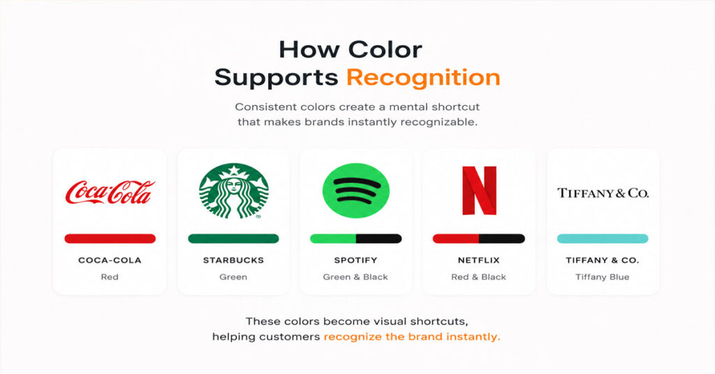
How Color Supports Recognition
Color becomes more valuable when used consistently over time.
Examples include:
- Coca-Cola’s consistent use of red
- Starbucks’ consistent use of green
- Spotify’s consistent use of green and black
- Netflix’s consistent use of red and black
- Tiffany & Co.’s consistent use of Tiffany Blue
These colors have become visual shortcuts for the brands themselves.
Customers often recognize the color association before reading the logo.
Recognition improves when colors remain consistent across every touchpoint.
Why Successful Brands Stay Consistent
Successful brands rarely change colors dramatically.
Small refinements occur over time, but the foundation usually remains intact.
Consistency provides several advantages:
- Stronger recall
- Improved trust
- Easier recognition
- Better marketing efficiency
- Clearer positioning
Frequent changes often reduce the value built through years of exposure.
Lessons Businesses Can Apply
Most businesses do not need a famous color.
Most businesses need a consistent color.
Three practical lessons apply across industries:
- Choose colors strategically.
- Use colors consistently.
- Maintain color standards across every platform.
Businesses that follow these principles often create stronger recognition than businesses that constantly experiment with new palettes.
How AmmaarDesigns Uses Color Theory In Branding Projects
Color selection should support business goals rather than personal taste.
At AmmaarDesigns, color decisions are evaluated through the lens of brand positioning, audience expectations, and long-term recognition.
Building Color Systems Instead of Choosing Random Colors
Many businesses choose colors individually without considering how those colors will function together.
A stronger approach involves creating a complete system.
That system typically includes:
- Primary colors
- Secondary colors
- Accent colors
- Neutral colors
- Accessibility standards
- Usage guidelines
This structure creates consistency across digital and print applications.
Balancing Psychology, Strategy, and Recognition
Color psychology provides useful insights, but strategy determines implementation.
A successful palette balances:
- Customer perception
- Industry expectations
- Brand personality
- Competitive positioning
- Long-term recognition
The goal is to create a color system that remains effective as the business grows.
Creating Palettes Designed for Long-Term Growth
Strong brands rarely require complete color overhauls.
The most effective palettes are designed to scale across new marketing channels, products, campaigns, and customer experiences.
Long-term thinking reduces future redesign costs while preserving recognition.
A palette should support growth rather than limit it.
Color Theory For Branding FAQ
What Is Color Theory in Branding?
Color theory in branding is the process of selecting and combining colors to influence perception, improve recognition, and create a consistent visual identity.
How Many Colors Should a Brand Use?
Most brands perform well with:
- One primary color
- One or two secondary colors
- One accent color
This structure creates consistency without becoming restrictive.
Can Brand Colors Influence Customer Decisions?
Yes. Brand colors influence perception, recognition, trust, and emotional response. Color alone does not determine purchasing decisions, but it contributes to how customers evaluate a business.
Should Businesses Redesign Their Colors?
Yes, if the current palette creates recognition problems, no longer reflects the brand position, or performs poorly across modern platforms. A redesign should solve a business problem rather than follow a trend.
Strong Brands Use Color With Purpose
Color theory for branding is not about finding the perfect color. It is about building a system that helps customers recognize, understand, and remember a brand.
Businesses that choose colors strategically often create stronger visual identities than businesses that rely on personal preference or short-term trends. Consistent color usage improves recognition, supports marketing efforts, strengthens trust, and creates a more cohesive customer experience.
The most effective brands use color with intention. They understand how color influences perception, maintain consistency across every platform, and develop systems that support long-term growth. Whether a business uses blue to communicate trust, black to reinforce premium positioning, or orange to appear approachable, success depends on applying those colors consistently across every customer touchpoint.
Strong brands are not remembered because they use popular colors. Strong brands are remembered because they use the right colors consistently.