
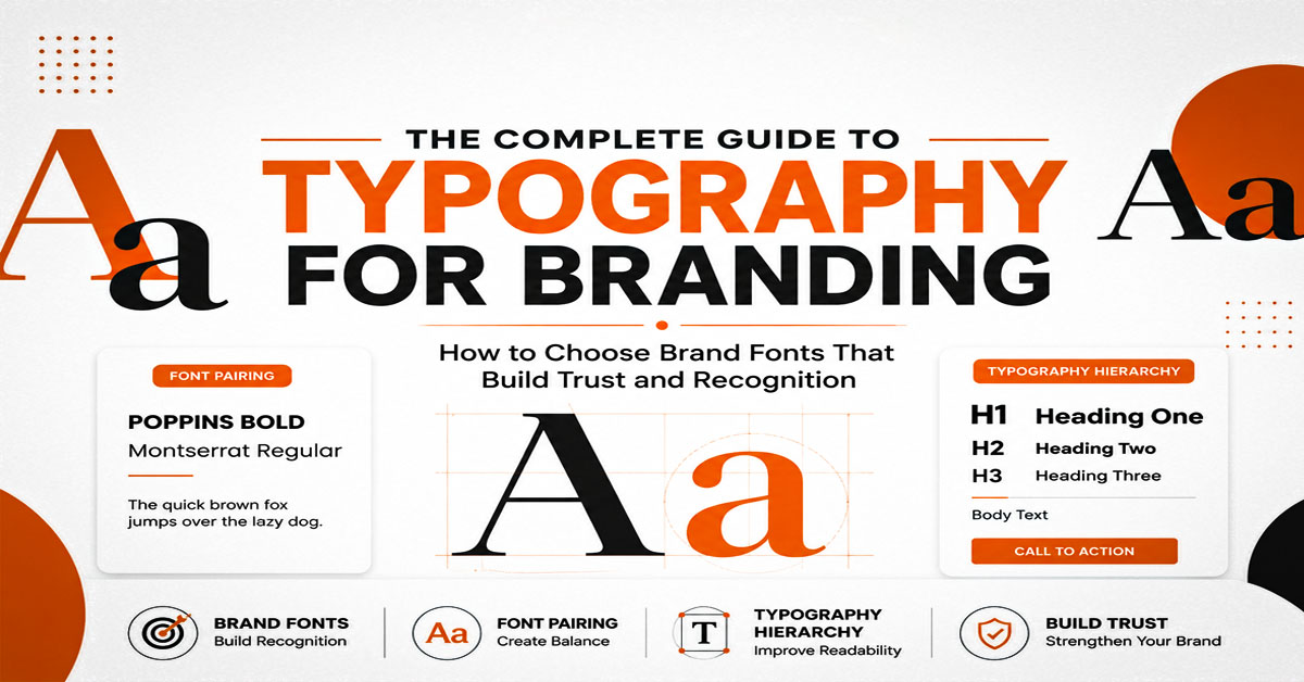
Typography for branding influences how people see your business before they read a single word. The fonts you choose communicate personality, professionalism, and credibility across every customer touchpoint. Whether someone visits your website, reads a brochure, opens a company profile, or sees your logo, typography helps shape the overall brand experience. Choosing the right brand fonts, creating a clear typography hierarchy, and pairing fonts effectively all contribute to stronger visual communication.
This guide explains what typography for branding is, why it matters, and how to choose fonts that align with your brand identity. You’ll learn the differences between fonts and typography, how typography affects customer perception, practical font pairing techniques, and common mistakes to avoid. By the end, you’ll understand how a well-planned typography system creates consistency across digital and printed materials while helping your brand become more recognizable.
What Is Typography for Branding?
Typography for branding is the strategic use of typefaces, font styles, spacing, and hierarchy to create a recognizable visual identity. It is more than selecting attractive fonts. Every typography decision influences how customers perceive your business and how easily they understand your message.
Professional typography appears across every branded asset, including logos, websites, business cards, company profiles, brochures, advertisements, packaging, presentations, and social media graphics. Using consistent typography helps businesses build recognition while creating a unified customer experience.
What Makes Typography Different From Fonts?
Typography and fonts are closely related, but they are not the same. A typeface is a complete design family, while a font is a specific variation within that family, such as bold, regular, or italic. Typography is the system that controls how those fonts work together through spacing, hierarchy, alignment, kerning, leading, tracking, and layout.
Professional designers treat typography as part of visual communication rather than decoration. Every adjustment helps improve readability, reinforce brand identity, and guide customers naturally through information. This structured approach separates professional branding from designs that rely only on appearance.
Why Typography Matters for Brand Identity
Typography is one of the strongest visual elements of a brand identity. Customers often recognize a business by its typography before noticing its colors or graphics. Consistent use of brand fonts creates familiarity and helps businesses establish a professional image across every communication channel.
Well-known brands such as Apple, Nike, Airbnb, and Coca-Cola have developed recognizable typography systems that remain consistent across packaging, advertising, websites, and printed materials. Their typography reflects each company’s personality while strengthening long-term brand recognition.
Designers including Massimo Vignelli, Paula Scher, David Carson, Jessica Hische, and Neville Brody have shown how typography can shape perception through carefully chosen typefaces, spacing, and hierarchy. Their work demonstrates that typography supports branding by making communication both memorable and functional.
Why Typography Matters in Branding
Typography influences how customers experience a brand from the first interaction. It affects readability, professionalism, emotional perception, and consistency across every platform. Businesses that invest in professional typography create stronger visual identities while making communication more effective.
Typography Shapes Brand Perception
Typography communicates personality before customers begin reading. Clean sans-serif typefaces often suggest innovation and simplicity, while traditional serif fonts communicate trust, authority, and heritage. Script fonts can introduce elegance, and display fonts can add character when used strategically.
Selecting typography that reflects your brand values helps customers form accurate expectations. Consistent visual communication strengthens positioning and creates a more memorable brand experience.
Typography Improves Readability and Recognition
Good typography makes information easier to understand. Appropriate font sizes, balanced spacing, and logical hierarchy allow readers to scan content quickly without becoming overwhelmed. Clear typography improves engagement across websites, presentations, brochures, and company profiles because customers spend less effort interpreting information.
Responsive typography also ensures that text remains readable on desktop computers, tablets, and mobile devices. Maintaining readability across every platform improves user experience while supporting stronger brand recognition.
Typography Creates Consistency Across Every Platform
Customers interact with businesses through multiple channels, including websites, email campaigns, printed marketing materials, product packaging, and social media. Consistent typography creates a familiar visual language that connects every interaction with the same brand identity.
A documented typography system defines heading styles, body fonts, spacing, font weights, and usage guidelines. This consistency makes future marketing materials easier to produce while protecting the brand’s integrity as the business grows.
How to Choose Fonts for Your Brand
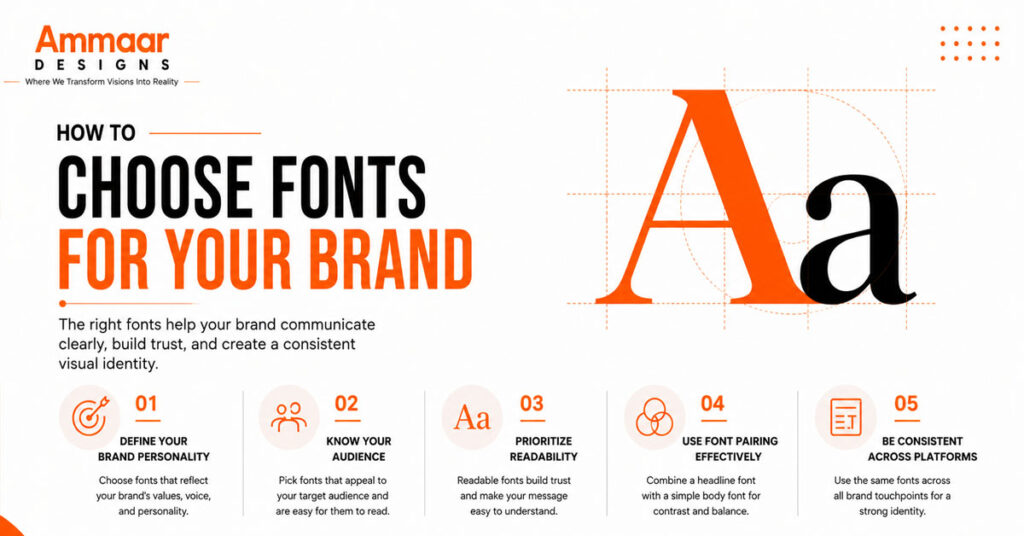
Choosing the right fonts begins with understanding your brand rather than following design trends. Every typeface communicates a different personality, and selecting the right one helps customers recognize your business across every platform. A strong typography system balances visual appeal with readability while supporting your overall brand identity.
Professional designers evaluate brand personality, audience expectations, readability, and technical performance before selecting brand fonts. This process creates a typography system that remains effective across websites, marketing materials, packaging, and printed documents.
Define Your Brand Personality
Your typography should reflect your brand’s personality before it communicates any message. A modern technology company often benefits from clean sans-serif typefaces, while a luxury fashion brand may prefer elegant serif fonts. Creative agencies sometimes introduce expressive display typography, provided readability remains intact.
Typography should align with your visual identity and brand voice. Choosing fonts that match your positioning creates a stronger connection with customers and improves recognition across every marketing channel.
Understand Your Audience
Your target audience should influence every typography decision. Younger audiences often respond well to modern, minimal typography, while professional industries frequently expect classic and highly readable typefaces. Understanding customer expectations helps narrow your font selection and supports more effective communication.
Accessibility is equally important. Typography should remain readable for users with different devices, screen sizes, and visual abilities. Accessible typography improves usability while creating a better experience across digital and printed materials.
Prioritize Readability
Readability should always take priority over decoration. Attractive typography has little value if customers struggle to read product descriptions, website content, or marketing materials. Clear typography allows readers to focus on the message instead of the design itself.
Professional designers improve readability by adjusting font size, font weight, line height (leading), letter spacing (tracking), and kerning. These refinements create comfortable reading experiences across websites, brochures, presentations, and business documents.
Test Fonts Across Print and Digital
A typeface should perform consistently across every platform before becoming part of your brand identity. Fonts that appear attractive on a desktop monitor may lose clarity when printed or viewed on smaller mobile screens.
Testing typography across websites, business cards, brochures, presentations, packaging, and social media graphics helps identify potential issues before launching your brand. Designers frequently evaluate fonts using libraries such as Google Fonts, Adobe Fonts, Monotype, and FontShop to compare readability, licensing, and performance.
Brand Fonts Explained
Brand fonts establish the visual tone of a business. Most professional brands rely on two or three complementary typefaces to create hierarchy while maintaining consistency. Understanding the characteristics of different font categories helps businesses choose typography that aligns with their industry, audience, and communication goals.
Serif Fonts
Serif fonts include small finishing strokes on each letter, creating a classic and established appearance. They are widely used by businesses that want to communicate credibility, tradition, and authority.
Industries such as finance, education, publishing, and legal services often rely on serif typography because it reflects professionalism. Popular serif typefaces include Garamond, Baskerville, Georgia, and Times New Roman. Luxury brands frequently choose refined serif fonts to reinforce premium positioning.
Sans-Serif Fonts
Sans-serif fonts remove decorative strokes, creating a clean and contemporary appearance. Their simplicity improves readability across websites, mobile applications, user interfaces, and digital marketing materials.
Popular typefaces such as Helvetica, Futura, Gotham, Inter, and Montserrat have become common choices for technology companies and modern brands. These fonts communicate clarity while remaining flexible across both digital and printed environments.
Script and Display Fonts
Script fonts imitate handwritten lettering and communicate elegance, creativity, or craftsmanship. Display fonts are more decorative and designed to capture attention in headlines, logos, or campaign graphics.
Both categories should be used selectively. They work best as supporting fonts rather than primary body text because excessive decoration reduces readability. When combined with a clean primary typeface, script and display fonts add personality without compromising consistency.
Font Pairing Guide for Professional Branding
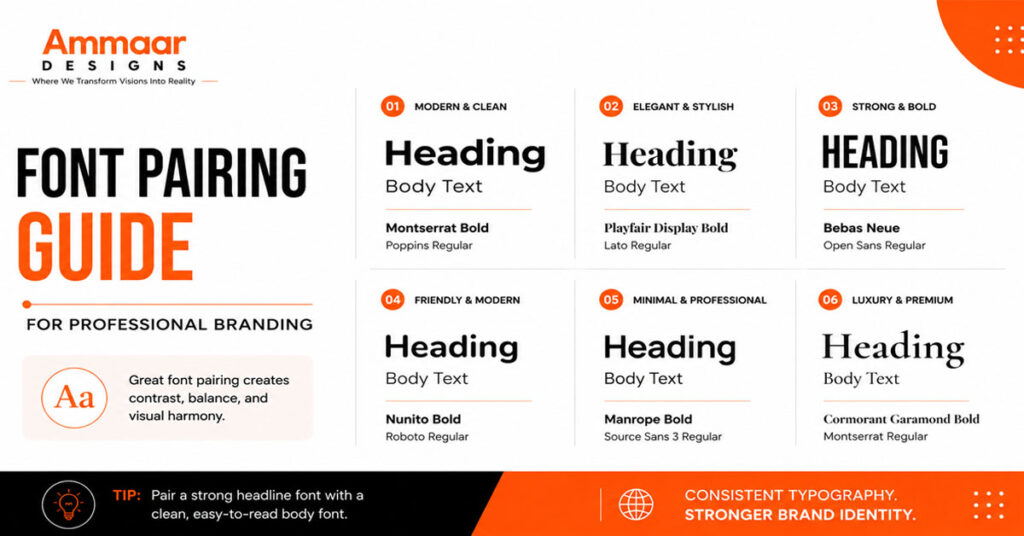
A professional typography system rarely depends on one font family. Combining complementary typefaces creates visual contrast, establishes hierarchy, and improves readability. Effective font pairing helps every heading, paragraph, and call to action work together while maintaining a unified visual identity.
Follow Simple Font Pairing Principles
Good font pairing focuses on contrast instead of similarity. Pairing a serif heading with a sans-serif body font creates a balanced design while maintaining readability. Limiting your typography system to two or three font families prevents unnecessary complexity and keeps your branding consistent.
Assigning a specific purpose to each typeface creates structure. One font may be reserved for headlines, another for body text, and a third for supporting elements such as quotes or calls to action. Clear typography rules simplify future design work and strengthen brand consistency.
Popular Font Pairing Examples
Several font combinations have become popular because they balance personality with readability. Playfair Display paired with Montserrat creates an elegant contrast suitable for luxury brands. Merriweather with Open Sans works well for editorial content, while Poppins and Lora provide a clean, approachable appearance for professional businesses.
These combinations should be treated as inspiration rather than fixed solutions. Every business has different communication goals, making custom font pairing more effective than copying another brand’s typography system. The best typography reflects your own identity while remaining consistent across every customer touchpoint.
Typography Hierarchy Explained
Typography hierarchy organizes information so readers understand where to look first. It uses font size, weight, spacing, and alignment to establish a clear reading order. A well-structured hierarchy improves readability, highlights key messages, and creates consistency across websites, presentations, brochures, company profiles, and social media graphics.
Strong typography hierarchy also improves user experience. Readers can scan content quickly, identify important information, and move naturally through each section without confusion.
Organizing Headings, Body Text, and Calls to Action
Every content layout should follow a consistent structure. Headings introduce topics, subheadings divide supporting information, body text explains ideas, and calls to action direct readers toward the next step. Each level should have a distinct visual style while remaining connected to the overall typography system.
Professional brands often use one font family with multiple weights instead of introducing several unrelated typefaces. This approach keeps designs clean while maintaining a recognizable visual identity across every platform.
Font Size, Weight, and Spacing Best Practices
Typography hierarchy depends on more than font size. Font weight, leading, tracking, kerning, white space, and alignment all influence how readers process information. Small adjustments often improve readability more than changing the typeface itself.
Responsive typography should maintain the same hierarchy on desktop computers, tablets, and smartphones. Consistent scaling ensures headlines remain prominent while body text stays comfortable to read regardless of screen size or print format.
Common Typography Mistakes That Hurt Your Brand
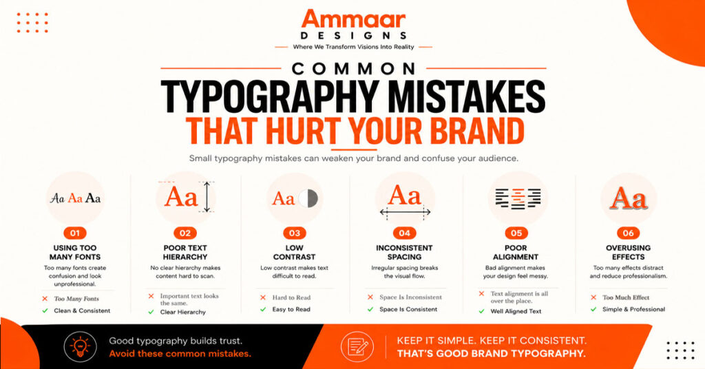
Even high-quality branding can lose credibility when typography is inconsistent or difficult to read. Avoiding a few common mistakes helps businesses maintain a professional appearance while improving communication across every customer touchpoint.
Using Too Many Fonts
Using several unrelated fonts creates visual inconsistency and weakens brand recognition. Every new typeface introduces another visual style, making designs feel disconnected. Most successful brands rely on two or three carefully selected font families that work together across every application.
A simplified typography system also makes it easier for designers, developers, and marketers to produce consistent branding without constantly making new font decisions.
Ignoring Readability
Typography should always communicate clearly. Decorative fonts, poor color contrast, tight spacing, or excessively small text make content difficult to read. Customers often leave websites or ignore printed materials when information requires unnecessary effort to understand.
Accessible typography improves the reading experience by maintaining appropriate font sizes, sufficient spacing, and clear contrast. These improvements benefit both user experience and long-term brand perception.
Inconsistent Typography
Changing fonts, heading styles, spacing, or alignment between different marketing materials creates confusion and weakens visual identity. Customers expect the same branding whether they visit your website, receive a proposal, read a brochure, or interact with your business on social media.
A typography style guide prevents these inconsistencies by defining approved typefaces, font weights, spacing, hierarchy, and usage rules. Consistent application strengthens recognition while making future design projects more efficient.
How AmmaarDesigns Creates Professional Brand Typography
Typography is a core element of every brand identity project at AmmaarDesigns. Rather than selecting fonts based only on appearance, we develop typography systems that reflect your business, improve communication, and remain consistent across every customer touchpoint.
Researching Your Brand
Every project starts with understanding your business, industry, target audience, and brand personality. This research helps identify typography that supports your positioning while differentiating your business from competitors.
We evaluate how your typography will appear across websites, marketing materials, packaging, presentations, and printed documents to ensure consistency before the design process begins.
Building a Consistent Typography System
After selecting appropriate brand fonts, we create a complete typography system that defines heading styles, body text, spacing, font weights, and hierarchy. This structured approach creates consistency across logos, stationery, company profiles, brochures, websites, social media graphics, and advertising materials.
Every typography decision is based on readability, usability, and long-term brand consistency rather than temporary design trends.
Delivering Brand Guidelines
Every branding project includes typography guidelines that explain how fonts should be used across different applications. These guidelines help designers, marketers, developers, and printers maintain the same visual standards as your business grows.
A documented typography system reduces inconsistencies, protects your visual identity, and ensures every future design reflects the professionalism of your brand.
Frequently Asked Questions
What Is Typography for Branding?
Typography for branding is the strategic use of fonts, spacing, and hierarchy to create a consistent visual identity that improves recognition, readability, and customer trust.
How Do I Choose Brand Fonts?
Choose brand fonts that reflect your personality, suit your audience, remain readable across print and digital platforms, and support a consistent visual identity.
What Is Typography Hierarchy?
Typography hierarchy organizes headings, body text, and calls to action using font size, weight, spacing, and contrast to improve readability and guide readers through content.
Why Is Font Pairing Important?
Font pairing creates contrast, improves readability, and helps establish a structured visual hierarchy while maintaining consistency across every branded asset.
Conclusion
Typography for branding is more than choosing attractive fonts. It creates a visual language that shapes customer perception, strengthens recognition, and improves communication across every platform. Selecting the right brand fonts, building an effective font pairing system, and applying a clear typography hierarchy help businesses present a professional and consistent identity.
Every typography decision contributes to the overall customer experience. From logo design and websites to business stationery and marketing materials, consistent typography builds trust while making your brand easier to recognize. Investing in a structured typography system supports long-term growth and creates a stronger foundation for every future marketing effort.